Spend some time with a color wheel to see what you like. You
remember this tool from high school art class; it shows all the colors
of the spectrum arranged in a circle and highlights the relationships
between them. You may find yourself naturally gravitating to one side of
the circle (say, cool blues and greens) or the other (warm reds and
oranges). “Blues are all about tranquility and relaxation,” Kelly says.
“Reds and rich earth tones are social-gathering colors. Choose according
to how you’re going to use the room and the mood you want to create.”
Check in with trends. Some perennial combinations never lose
their charm, Kelly says, like crisp blue-and-white kitchens or calming
green bedrooms. But new ideas are exciting, too:
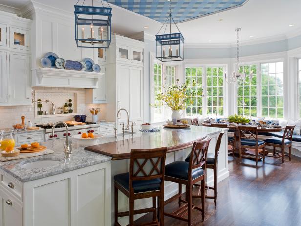
A strong movement toward natural, eco-friendly materials has put granite tones, greens, browns, and whites in the spotlight.
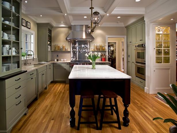
Whether you go neutral or bold on the wall, try accenting with
metallic paints on furniture, lighting, plumbing, and accessories.
“Silver, gold, bronze, copper, and pearl add elegance without being too
heavy,” Kelly says. “In daylight, these colors appear neutral; in the
light of evening, they impart a welcoming glow.”
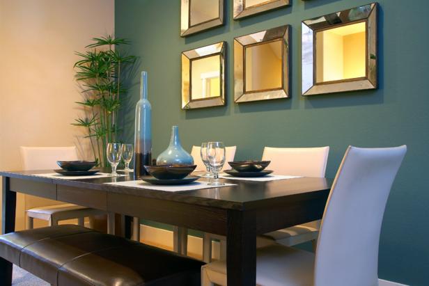
If you want to make a statement, strong color palettes derived from
Russian, Indian, and Latin design are on trend; blend them with
traditional colors or neutrals for a thoroughly modern look.
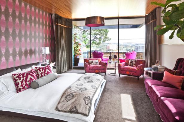
Technology-inspired saturated colors like lime green, royal blue,
apple red, sunshine yellow, and tangerine radiate energy and lend a
sense of richness to a room.
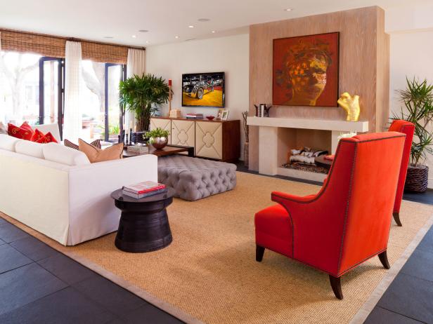
Use color relationships as your guide, but be willing to experiment. Complementary
colors are those that lie opposite each other on the color wheel — that
means they’re visually balanced, although the high contrast may be more
drama than you want in a room. “Approximately opposite colors work
well, too,” Kelly says. “For example, sage green (a yellow-green) pairs
beautifully with violet. Sometimes combinations are more interesting
when the colors aren’t direct opposites.” You may also like the look of
an analogous color scheme, which pairs colors that lie directly next to
each other on the wheel; these combinations are common in nature, so we
tend to find them pleasing.

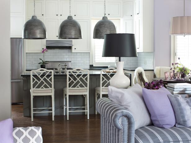
Layer tone on tone for a sophisticated effect. “A
monochromatic color combination uses shades of a single color,” Kelly
says, “to create an effect that’s serene and elegant. The key to success
with this approach, because it’s so subtle, is to add texture and use
varying scales of pattern in the materials you choose.”
Go for a test drive. Paint swatches won’t tell you everything
you need to know. Buy the manufacturer’s test size in your new color and
brush some on the wall (preferably where you can hide it with a picture
later). “Look at your paint sample in the morning, at noon and at
night,” Kelly advises, so that you can see how the color changes as the
light quality changes.

Don’t hold back. If you’re looking to inject some personality
into a humdrum space, don’t be afraid to slather on a big, expressive
color for the walls. You can always combine that bold wall color with
neutral furnishings to make a statement without creating a headache.
“There’s really no reason not to experiment with paint on walls, because
it doesn’t represent a big investment to do it or to change it later,”
Kelly says. “Color is undoubtedly the shortest route to a dramatic
setting.”
No comments:
Post a Comment